Search for:
list
the
join
.
.
.
.
.
.
contact
blog
shop
portfolio
services
about
home
free wallpapers
shop all
Travel
Wellness
Home Tours
Design 101
My Journal
My Home
categories
Search for:
jacquelyn
meet
SHOP
the
HIGHLIGHTS
Interior Design
read post
Apr 25
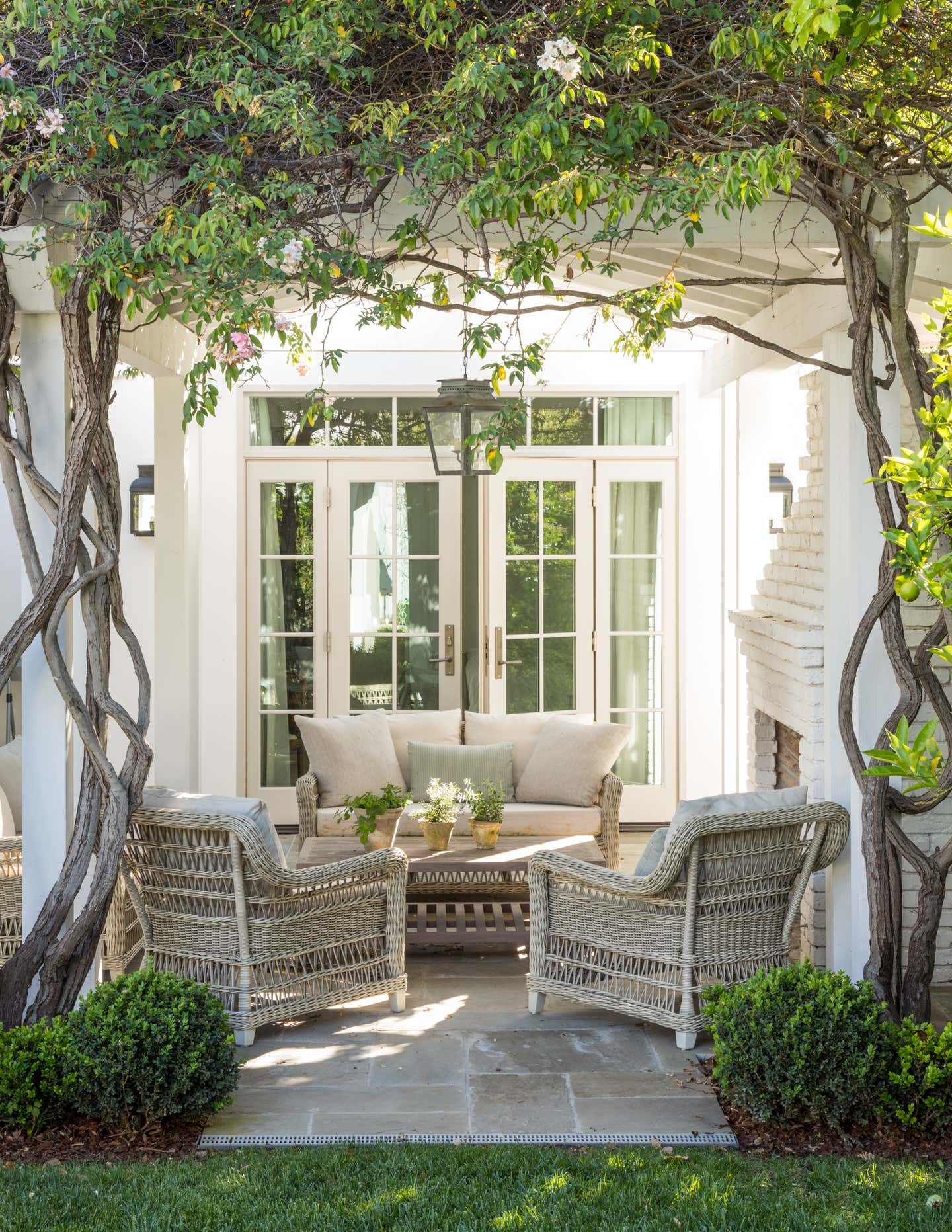
Get The Look: A Classic Patio
read post
Apr 18
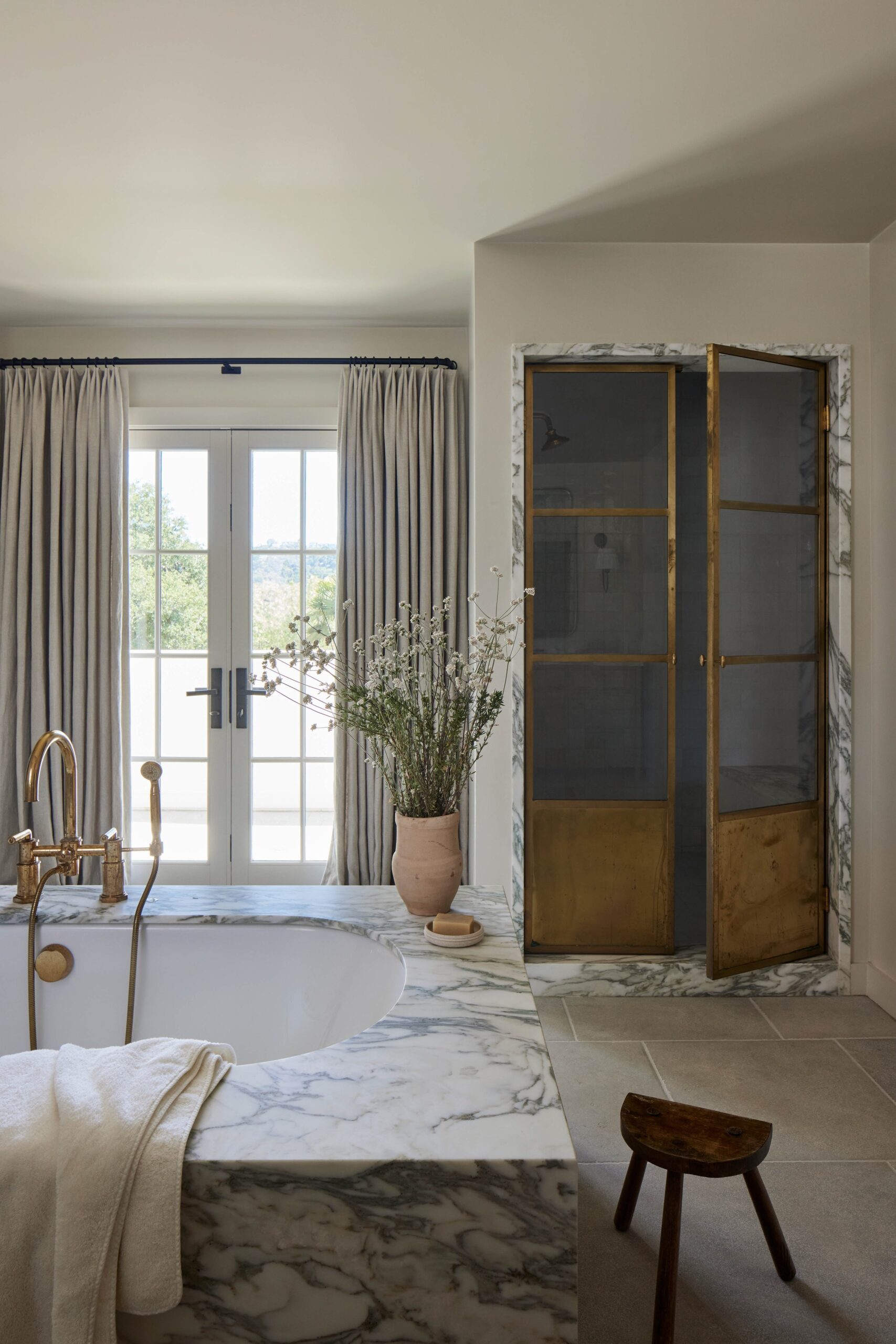
Call Her Daddy’s Home Tour: A Serene Country Retreat
read post
Mar 28
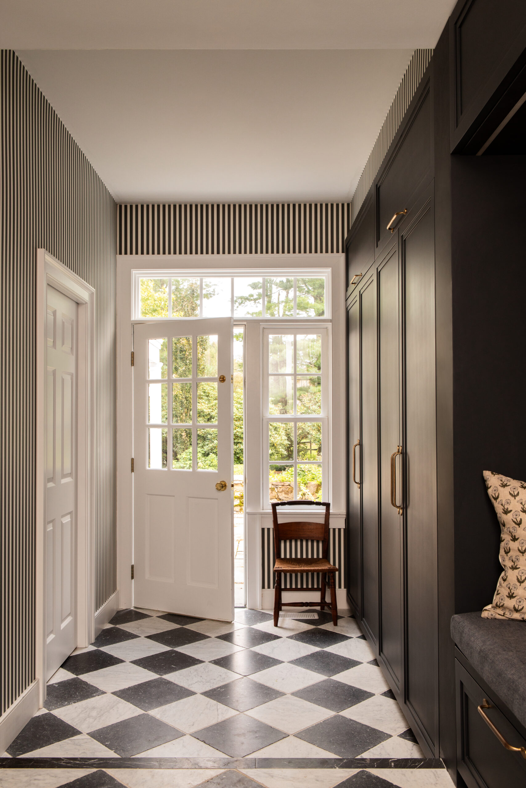
A 200-Year Old Home Brought to Life
read post
Mar 19
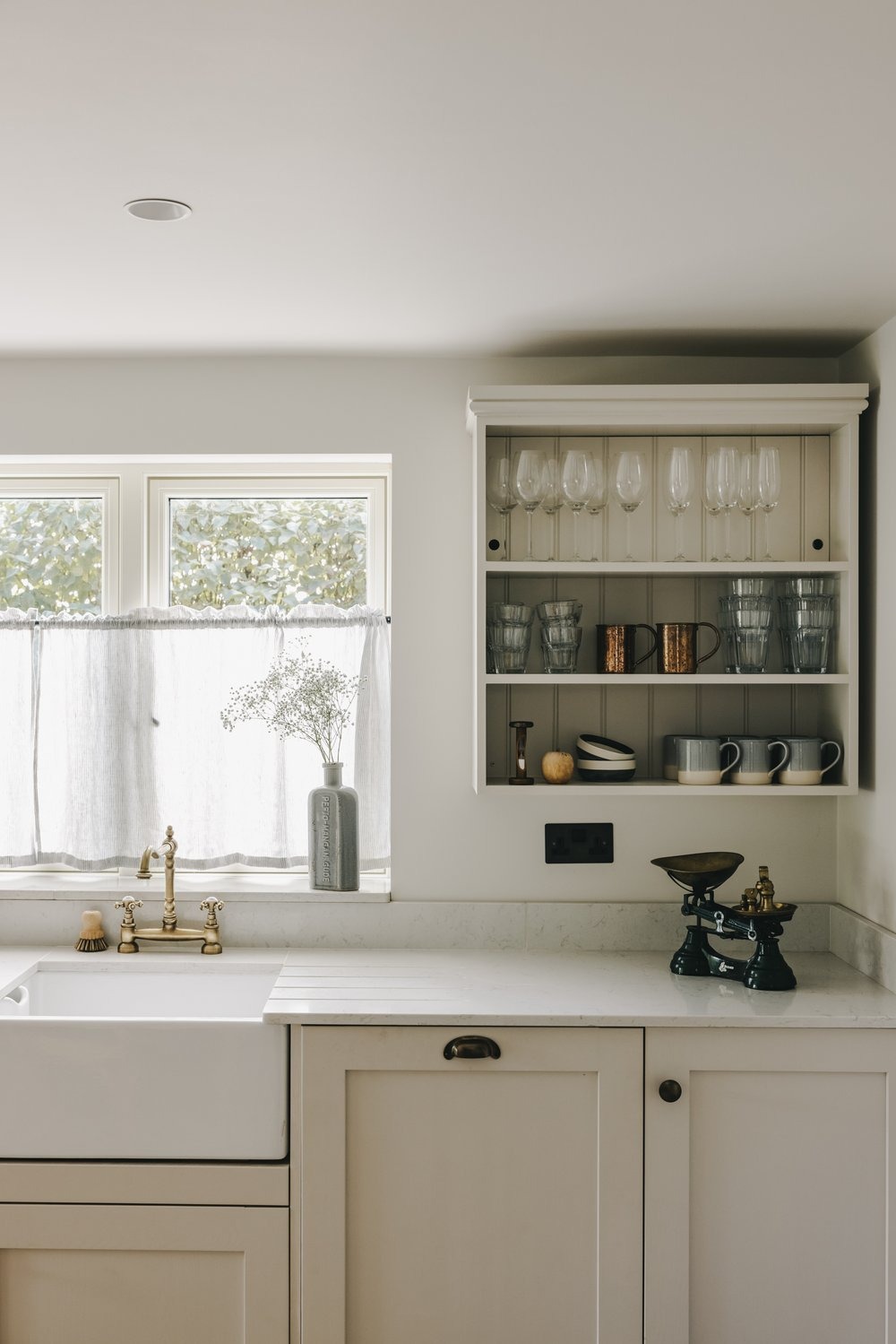
A Holiday Cottage In A Picturesque Village
older
MY HOME
VISIT
the
SHOP
HOME TOURS
the
INSPIRATION
contact
THE BLOG
about
portfolio
services
home
the
STUDIO
JOURNAL
shop all
DESIGN 101
TRAVEL
wellness
Search for: